

Loyal Captain on Residential Design
Written by Cheryl Weber. Photos by Kevin Scott.
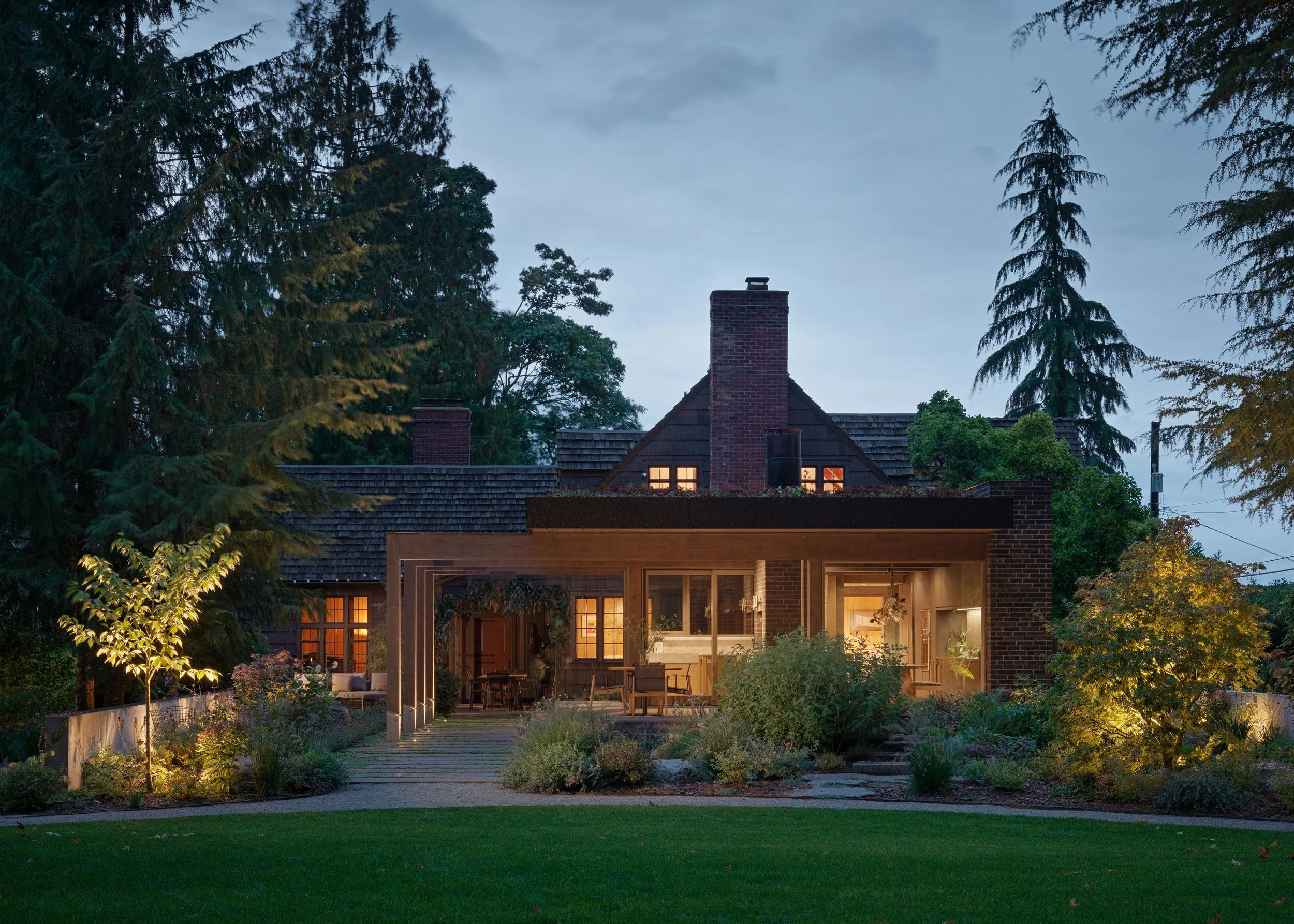
Idyllically situated beside Puget Sound, Seattle’s North Beach neighborhood has a strong Scandinavian heritage. A century ago, many Norwegians, Swedes, and Finns immigrated to work in the fishing and timber industries and built homes here. Ship captain Ole E. Nilsen was one of them. Now a historic landmark, the house he built in 1933 was reportedly a replica of his boyhood home in Bergen, Norway. Fortunately, the hallmarks of its meticulous craftsmanship are well-preserved, including the old-growth western red cedar shingles, Douglas fir walls and ceilings, and hand-painted rosemaling—a traditional Norwegian style of folk art.
Heliotrope principal Mike Mora, AIA, who lives close by, had been driving past the house for years, but it wasn’t until he traveled to Rome that he ran into the current owners. “I met these guys for the first time at a concert, and I said, ‘So, wait, you guys live in my neighborhood? Where?’ They described the house, one of my favorites in the city,” Mike says. “I’d had a chance to tour it with the previous owners. Eight months later, the clients sent us an email.”
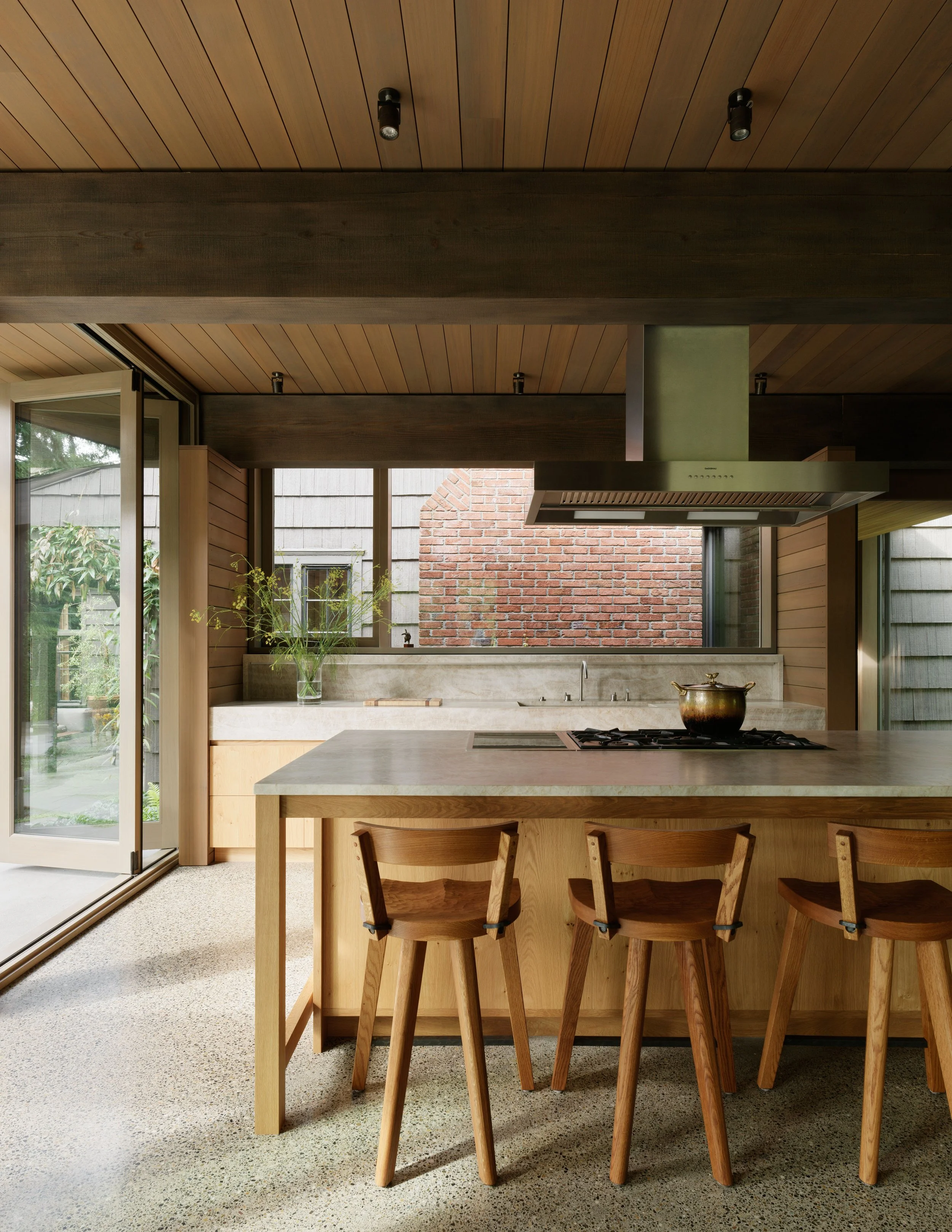
They wanted a one-story kitchen addition to remedy the small galley kitchen that many of these houses have—too confining for this family who likes to hang out where they cook. There was plenty of room to expand: a big yard on the south side of the house held an old tennis court. “That’s the side the original kitchen was on,” Mike says. “It made sense to go out to this new building and then to convert the original kitchen into a nicely finished adjacent pantry with a sink, dishwasher, and wine storage.” Opposite the galley kitchen is the original dining room. Thus, the sequencing of spaces seemed clear. With the pantry and dining room close by, one moves through a glass-walled passageway that connects the house to the addition.
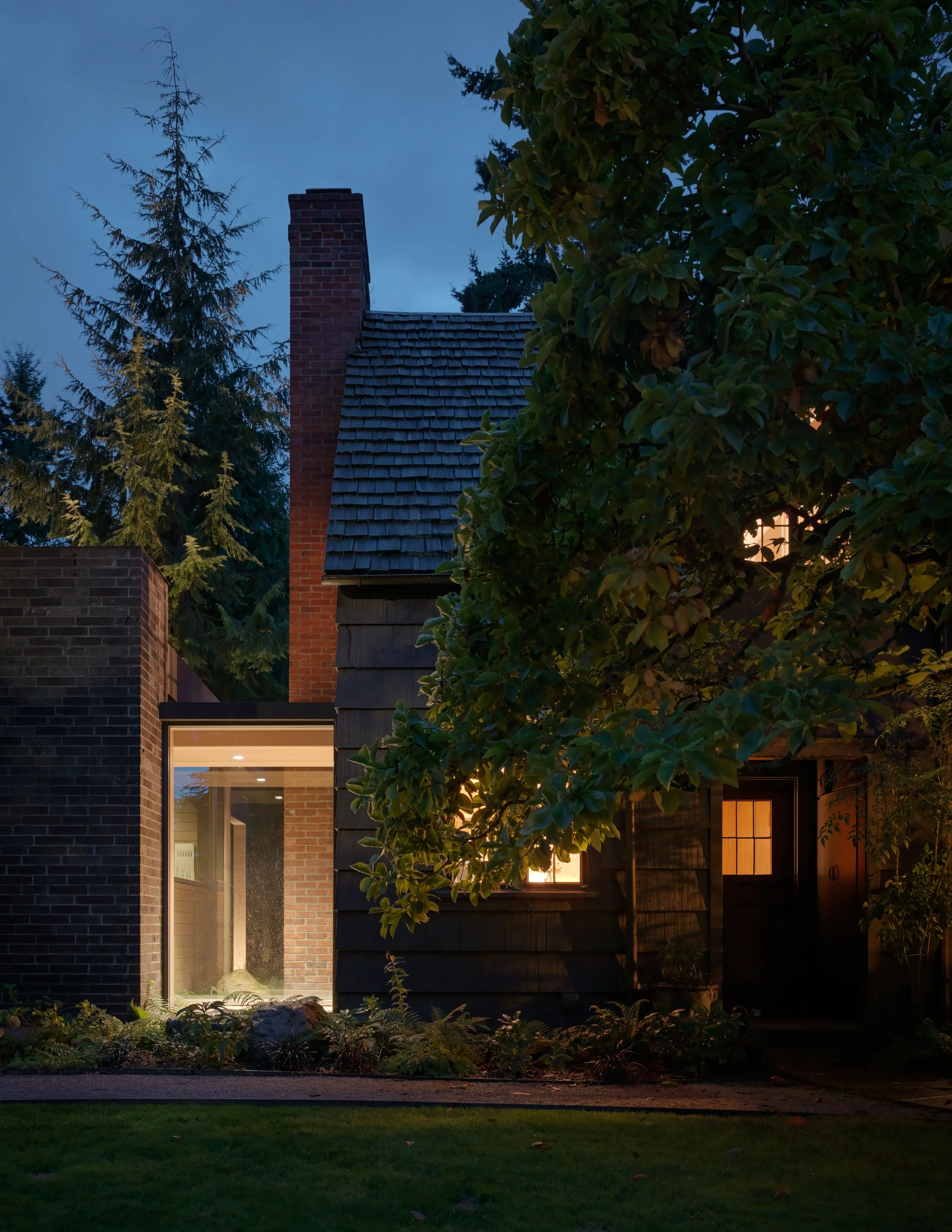
A Separate Piece
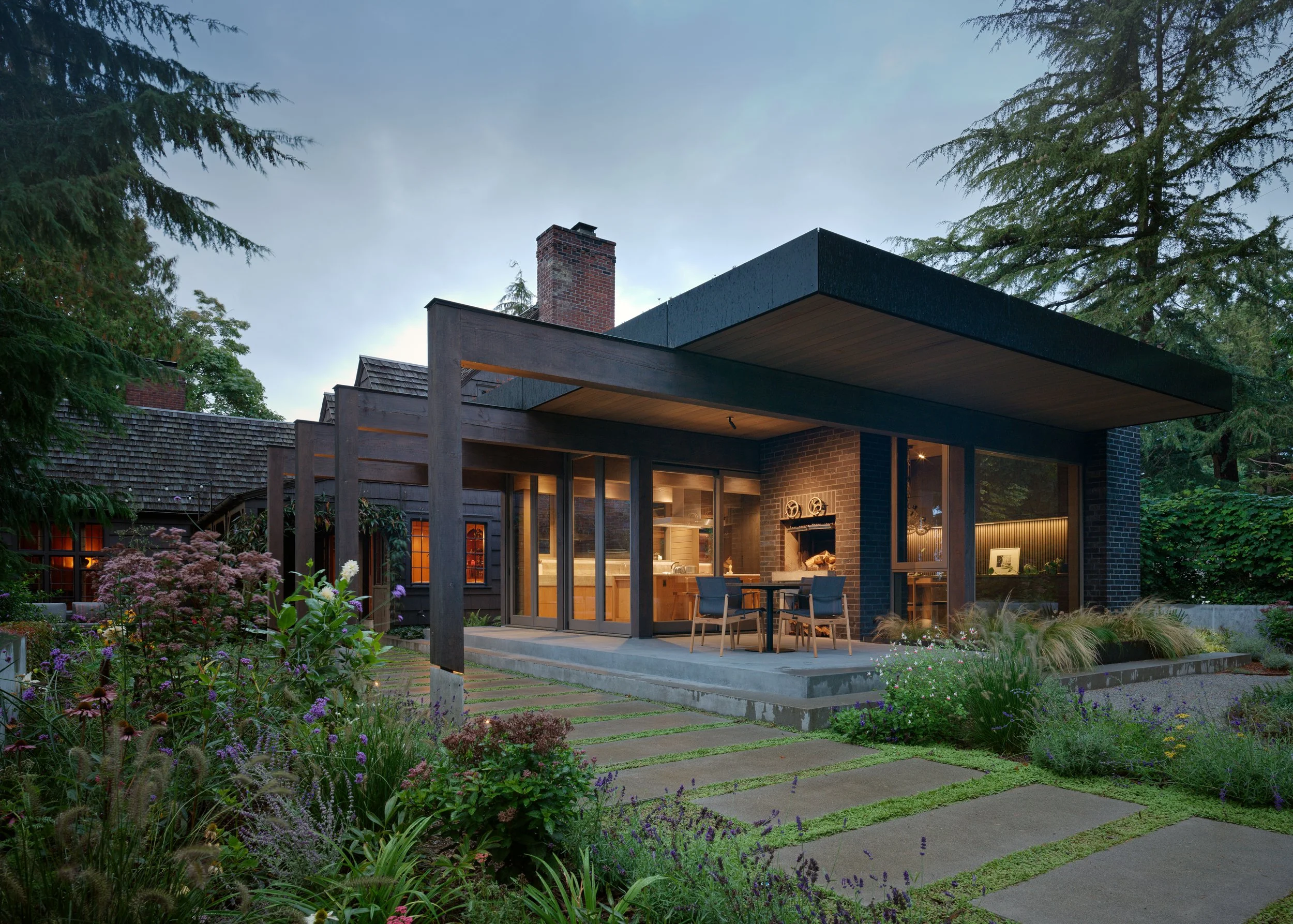
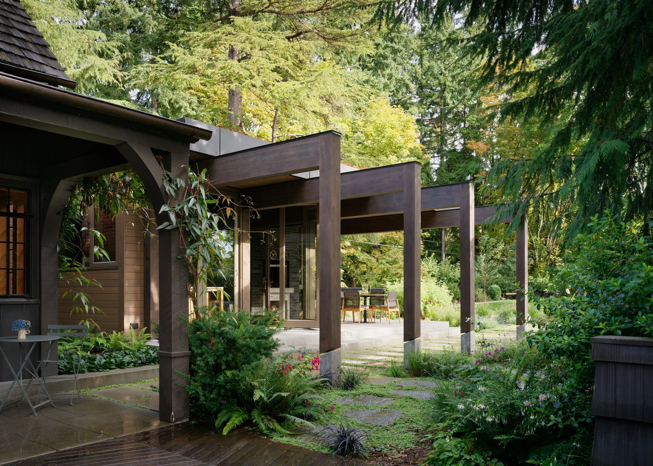
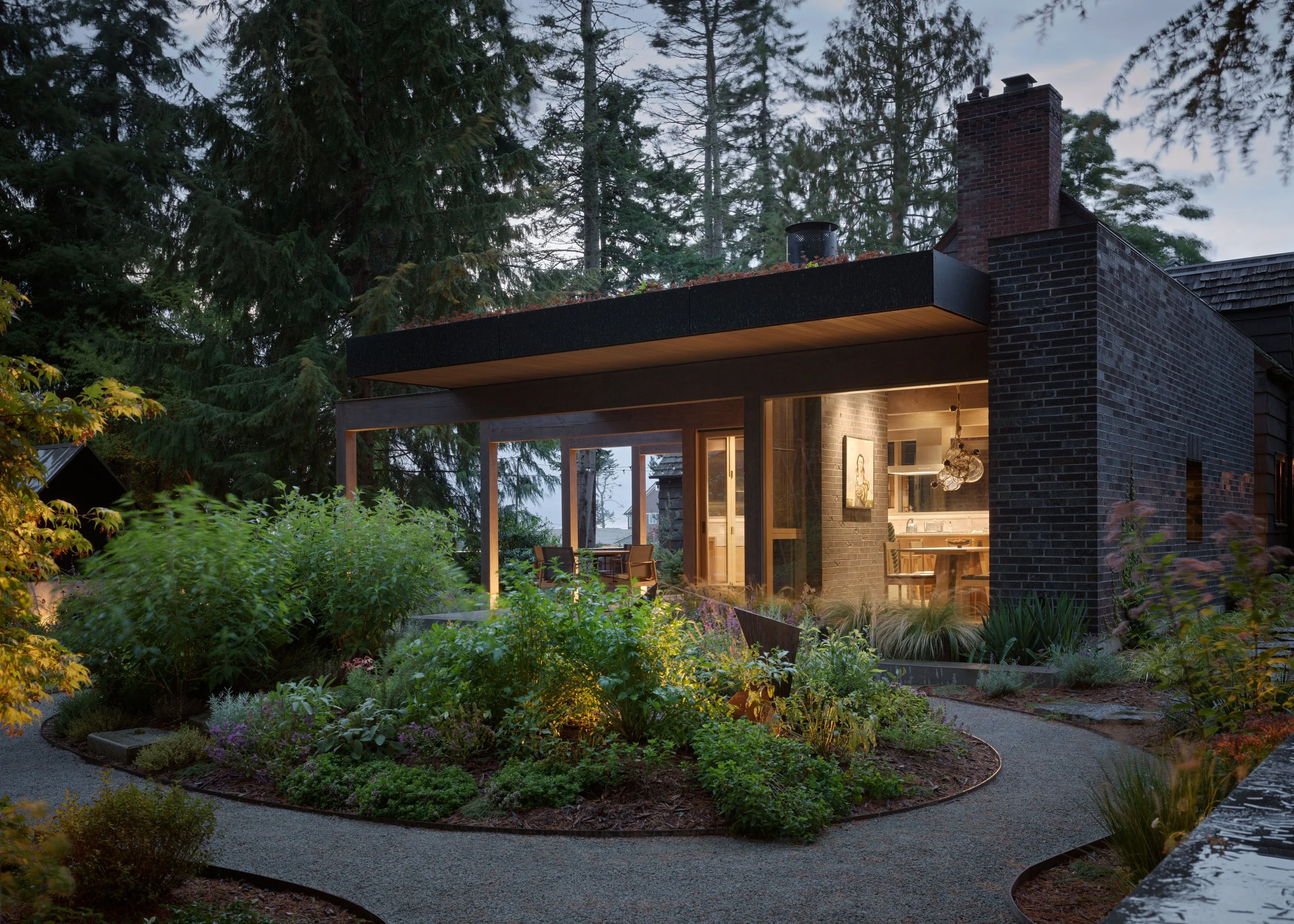
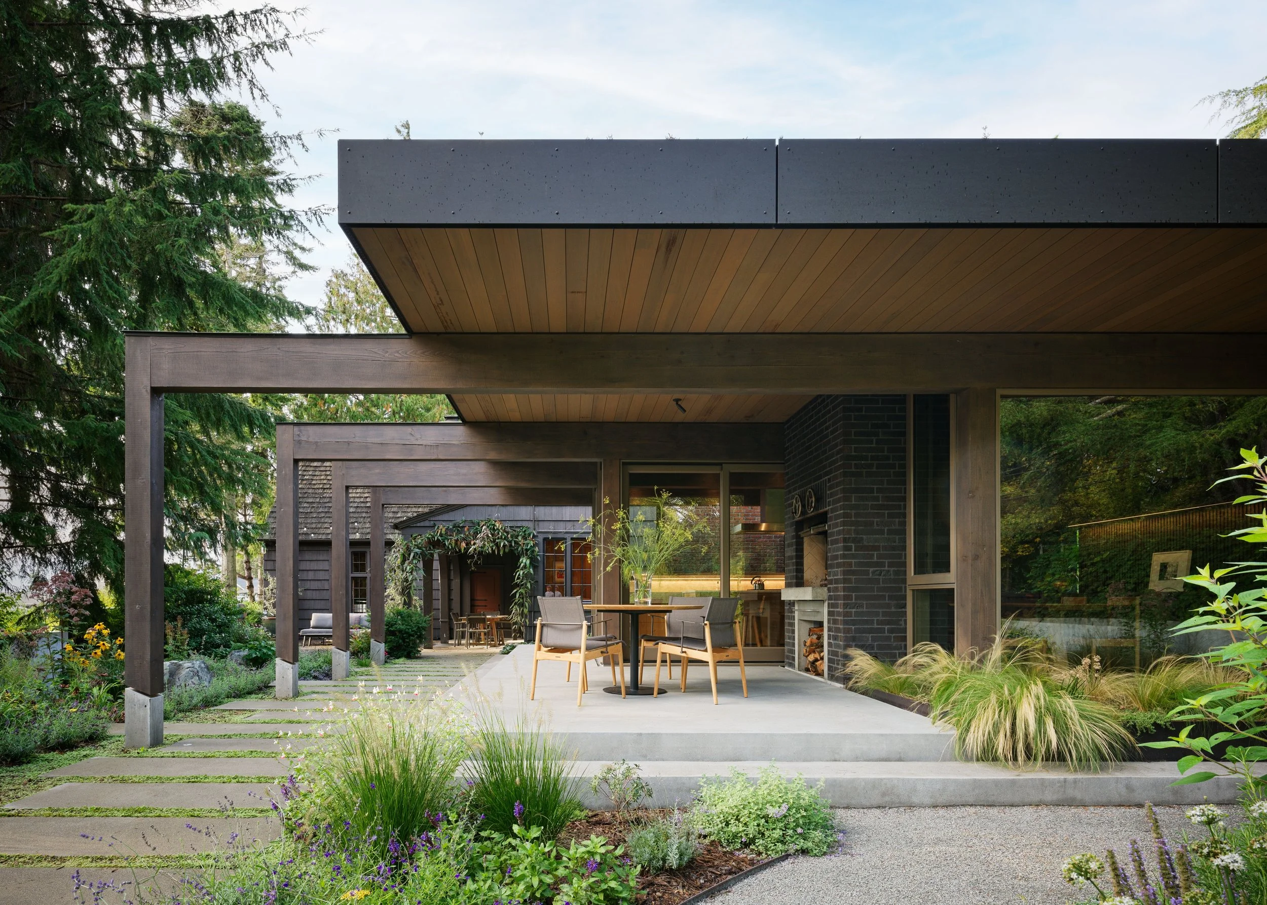
Any alterations, of course, had to be approved by the landmark board. “Interestingly, they prefer it if you don’t make the new addition something that seeks to mimic the original character of the house,” Mike says. “They want to make sure the historic building is identifiable and any addition to it doesn’t blend in.” That was fine with the team, who weren’t interested in mirroring the original house, either. However, they took inspiration from the home’s heavy timbers and a covered porch with supportive posts off the dining room. In the new flat-roofed, post-and-beam scheme, four posts and beams extend out to align with the dining room’s posts, creating an outdoor terrace with a wood-fired barbecue and establishing a walkway between the two buildings. The posts sit on concrete plinths cut at an angle to shed water. The result is a contemporary structure that harmonizes with the house.
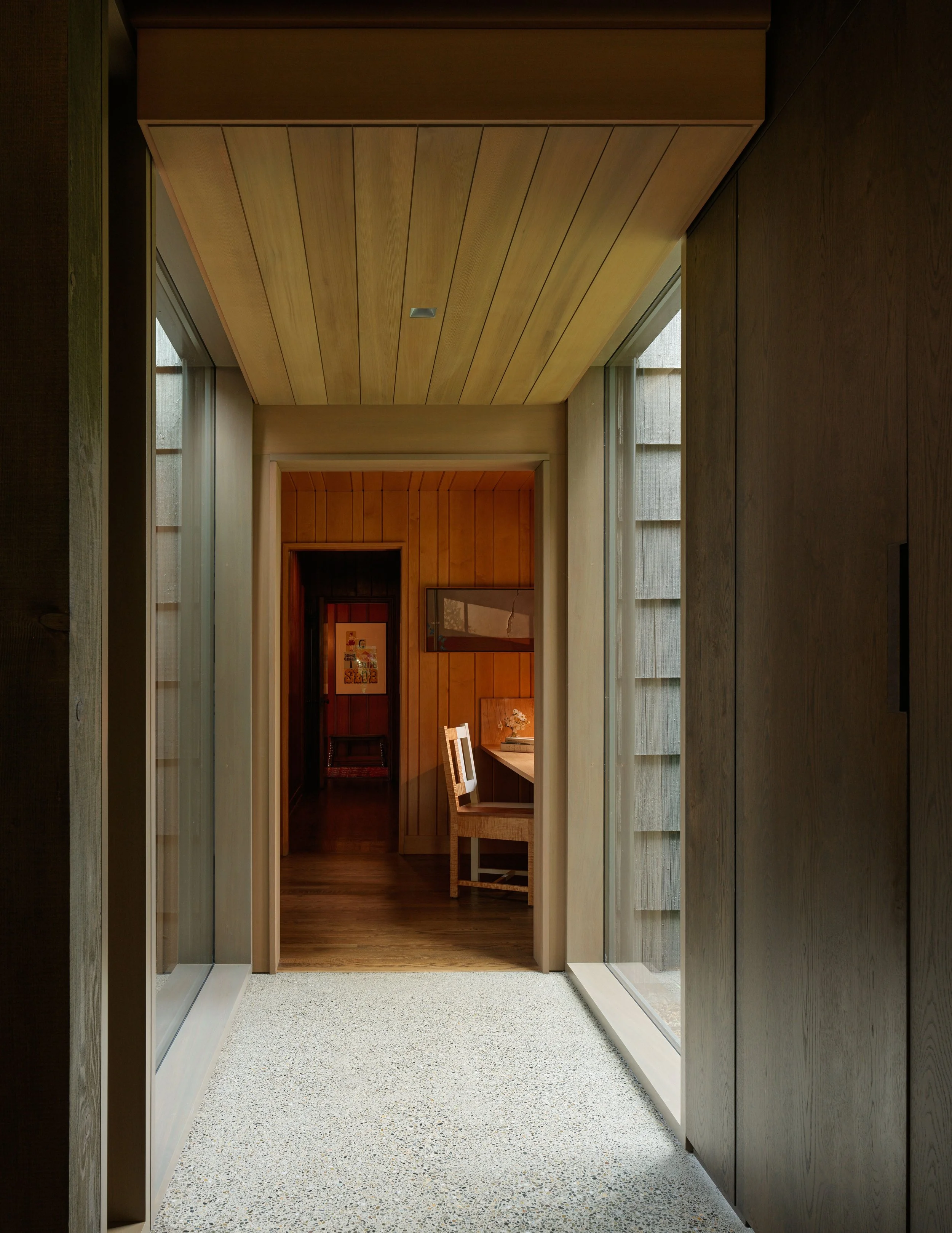
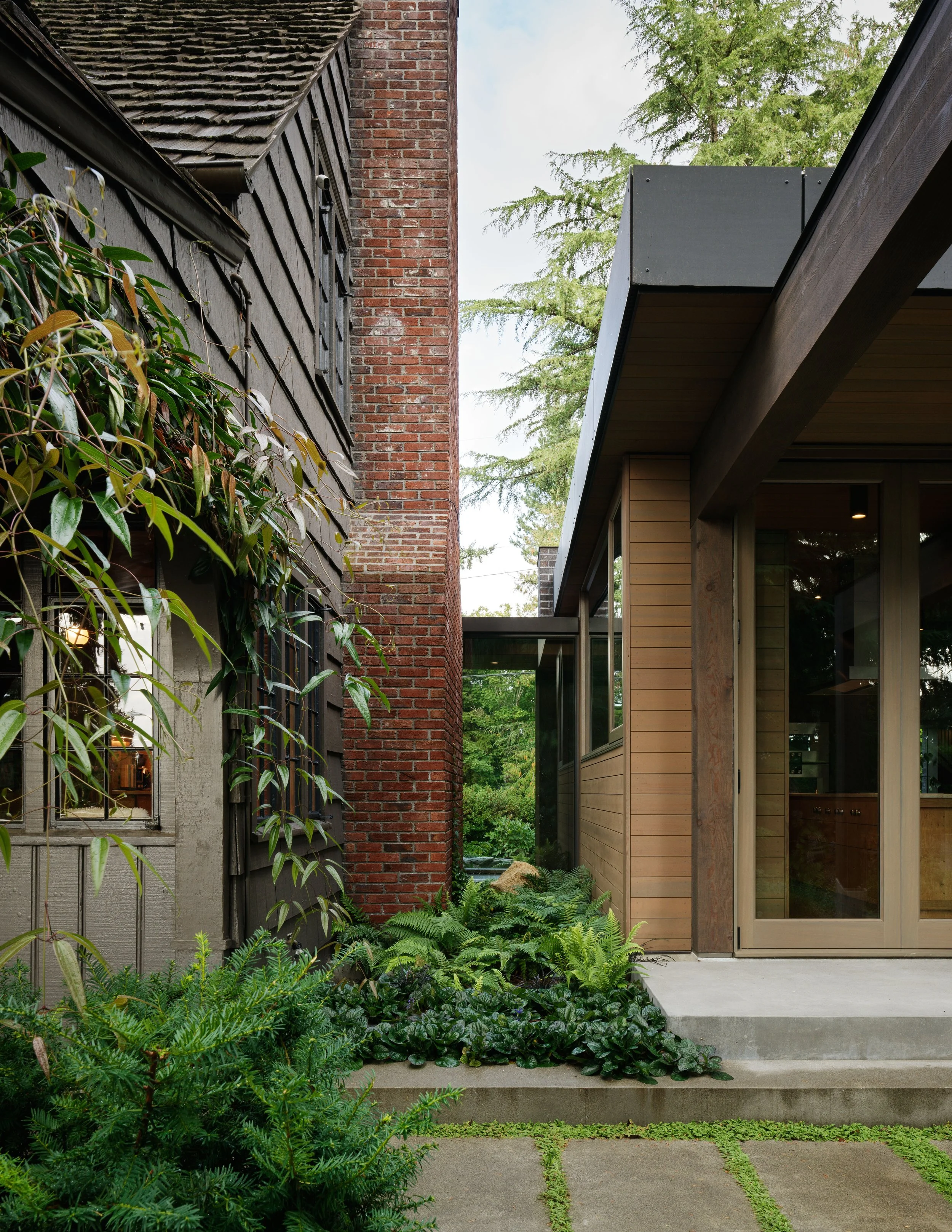
“We wanted to make sure we were stitching this thing together in a way that felt right,” Mike says. “You leave the existing house and cross this hallway with the glass walls to enter the new building. It’s an appropriate, healthy connection, but there is a clear threshold separating them.” The dark brick wall on the addition’s street side underscores that distinction. Made from a random composition of smooth and textured bricks, the wall forms a heavy mass that the kitchen pavilion nestles against, away from the street. The brick reappears behind the outdoor grill and comes inside at the breakfast nook.
One of the biggest construction challenges, says Dovetail General Contractors’ Scott Edwards, was mobilizing to minimize the impact on the vegetation. “There was a lot of materiality—brick, timbers, glass,” he says. “In juxtaposition to the main house with its big trims, the addition is more modern and minimalist. It was fun to see how they fit together and how they differ from each other. The glass gasket that connects the new kitchen to the old house was a nice way to make that transition.”
The building’s heavy posts and beams are premium-grade Douglas fir, with checks and cracks that supply character. The ceiling is made of 2 ½-inch-thick tongue-in-groove structural car decking with a 1/4-inch clear cedar veneer on the underside. “There are no joists or rafters above that; it’s the structural roof, then a membrane and green roof,” Mike says. “The kids’ bedrooms look down on it, and the daughter climbs out onto it from her window. With spring and summer growth, the vegetation is visible from the ground.”
Craft Tradition
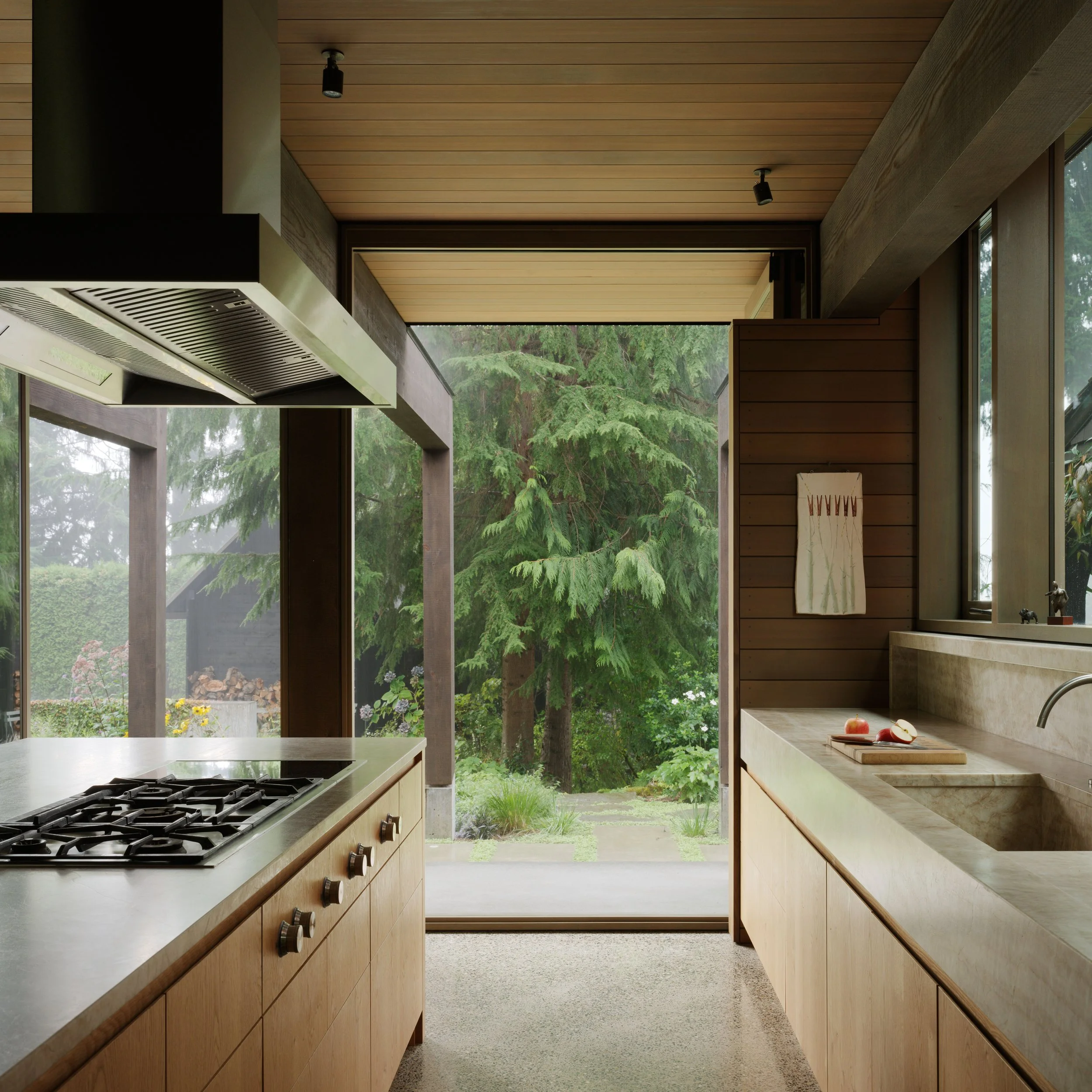
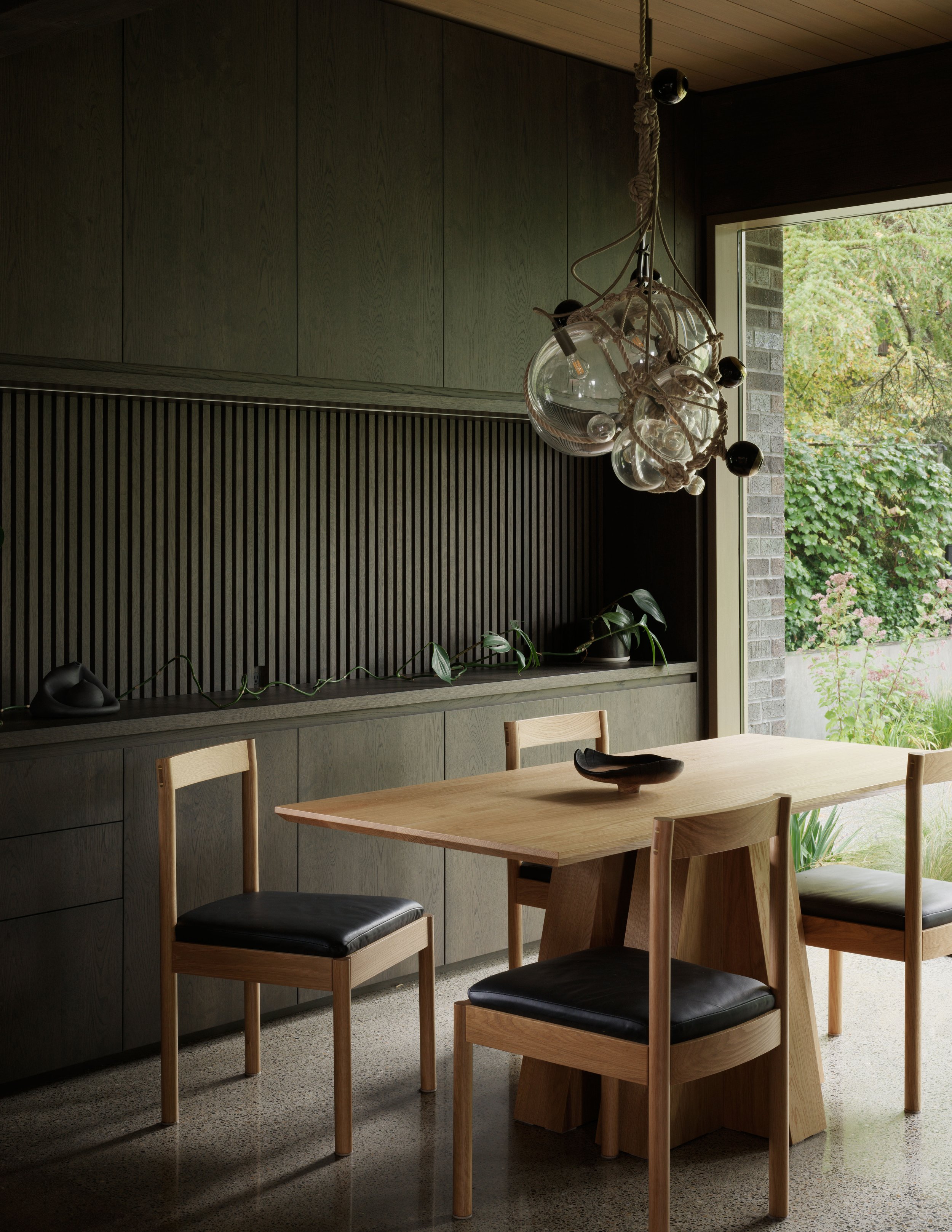
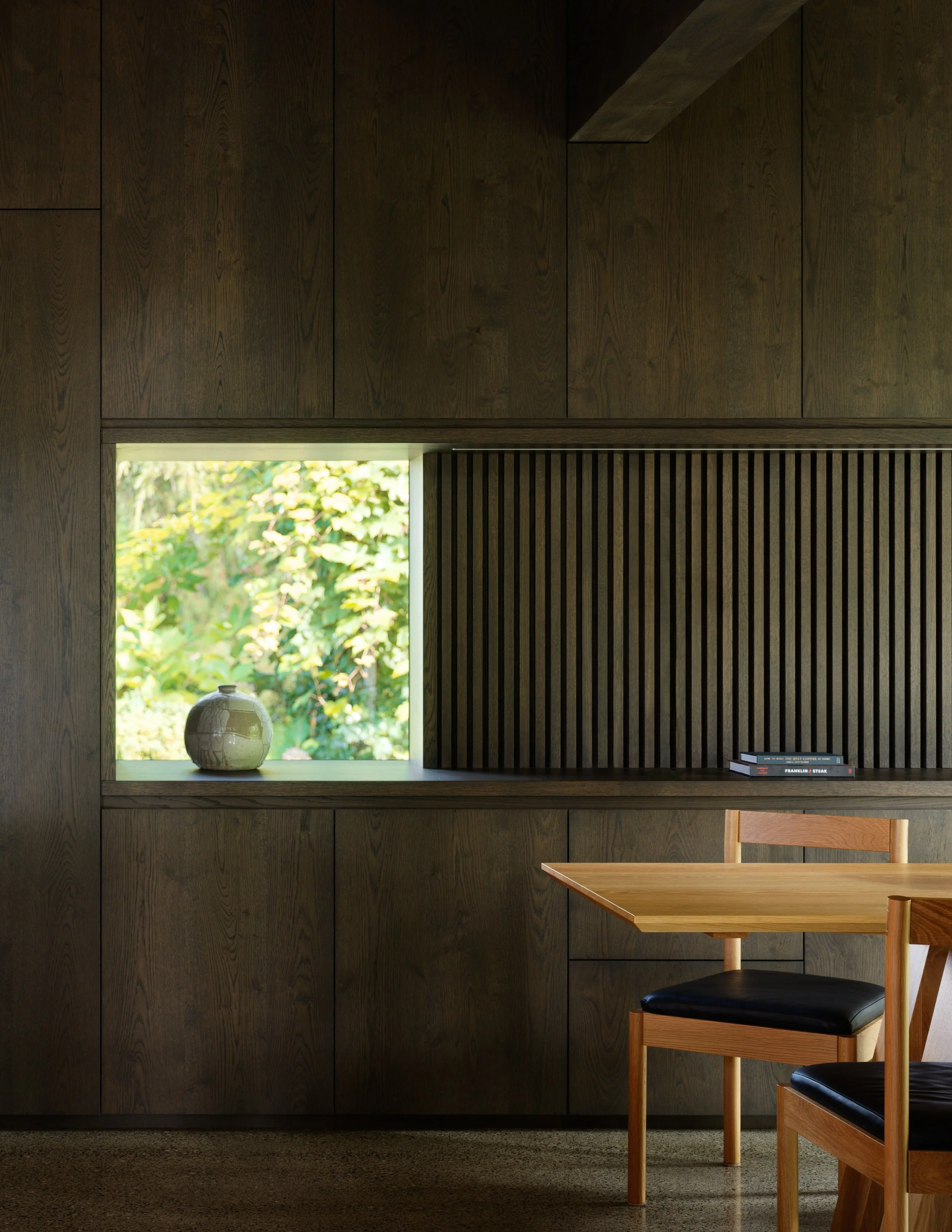
Inside, the addition’s layout is straightforward, with a cooktop in the white oak island, wall ovens, and a bump-out for a table in front of a full-height window. The sink wall incorporates another window looking back to the house, facing the old brick chimney across a 7-foot gap. In the dining nook, an undercounter beverage fridge is hidden in dark-stained cabinetry, a reference to the black masonry outer wall on this side of the addition, where a window pokes through. In keeping with the modernist aesthetic, round, trimless electrical outlets almost disappear into the wall, and finger pulls CNC-routed into the top edges of the wood cabinetry eliminate the visual clutter of handles. Quartzite countertops with a leather-like finish match those in the new pantry. And the walls are fully paneled, like the rest of the house.
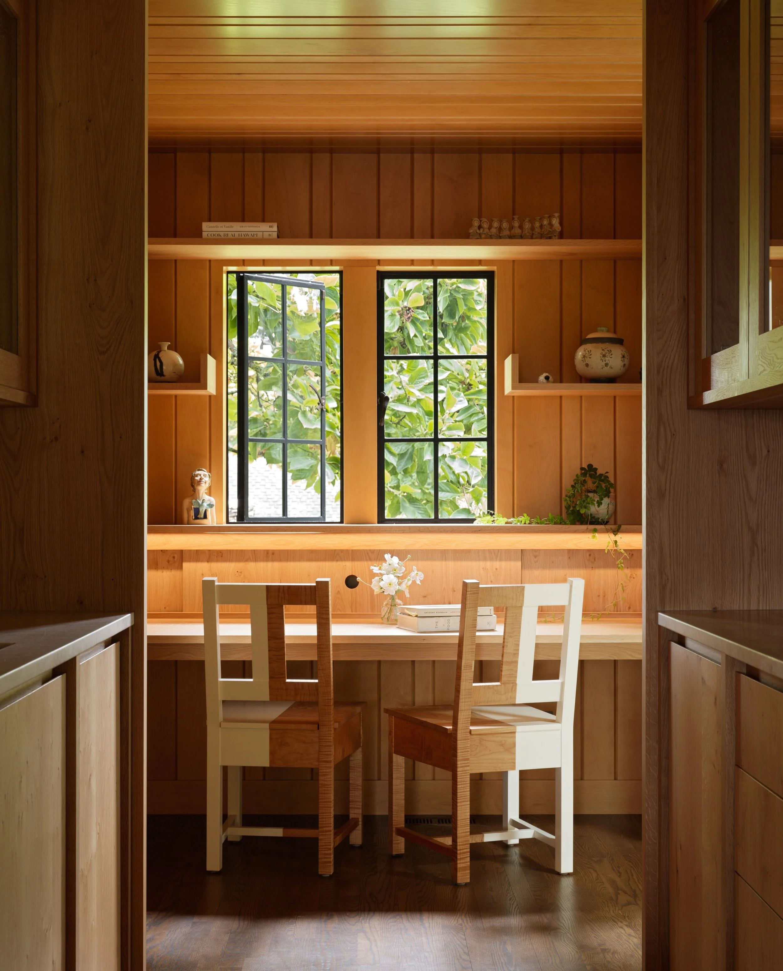
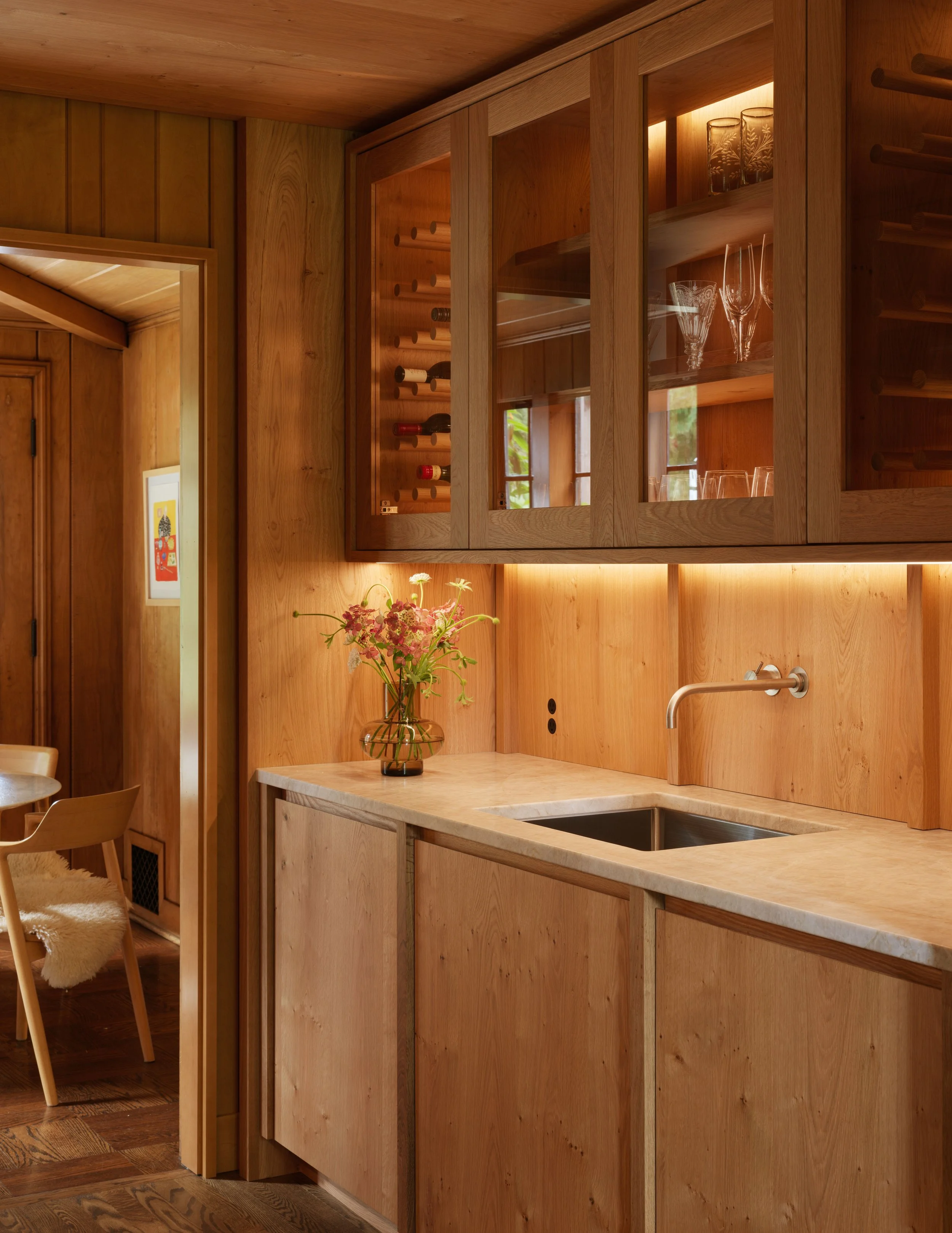
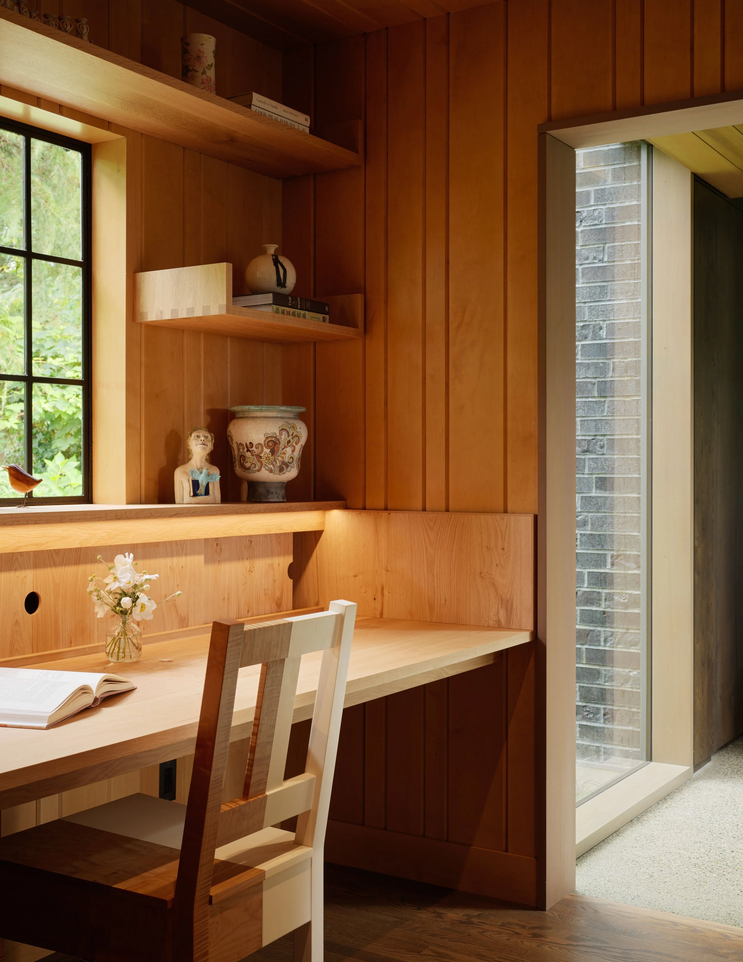
While the addition has radiant heated, polished concrete floors, the house’s floors are oak. These were reinstated in the original kitchen after it was gutted to create the jewel-box-like butler’s pantry. The pantry cabinets have a rustic white oak veneer, an echo of the original knotty pine. “The casework wraps the walls and ceiling as one piece,” says Scott. “It was like inserting a ship into a bottle because the two door openings to the pantry were really small. We built the entire thing, including the ceiling, in our shop, then took it apart and installed it in the new pantry, putting the ceiling in first and the cabinet walls below.” They also built a desk into a niche near the passageway to the addition. The paneling there is new but a match to the old.
The clients’ commitment to craft informed design decisions large and small. An early indication of this mindset was their collection of art and furniture, including a large dining table and chairs by Roy McMakin, a Saarinen tulip table, and Hiroshima armchairs. Although there was a budget, the clients asked the architects for their best ideas and were open to its evolution. “Their ambition was high in terms of quality of materials and systems,” Mike says. “As we walked through decisions like plumbing fixtures, they had a strong sensibility about what they liked and were just as often driven by form as by function.” For example, the Vola plumbing fixture, based on an Arne Jacobsen design, is “not the most practical kitchen faucet, but for them the beauty of the object might just as well trump function.”
The clients’ appreciation for thoughtful design and craft is very much in keeping with the spirit of the original house, and the addition honors that tradition. Although the firm typically takes on larger-scale residential and commercial projects, this one was worth the effort. “It’s small but something we’re proud of,” Mike says.
Loyal Captain
Seattle
Architect: Mike Mora, AIA, Heliotrope Architects, Seattle
Builder: Dovetail General Contractors, Seattle
Interior designer: Heliotrope Architects
Structural engineer: Swenson Say Fagét, Seattle
Geotechnical engineer: PanGEO, Seattle
Landscape architect: David Berleth, Ironwood Tree, Seattle
Lighting designer: LightPlan, Seattle
Project size: 500 square feet
Site size: 0.75 acre
Construction cost: $2,000 per square foot
Photography: Kevin Scott